Choice of area

I feel my most successful project was the one involving found images to develop a narrative within visual communication because I was surprised with the tutor’s positive reactions as I wasn’t entirely sure what I was doing was right. This reassured me that Visual Communication is probably the right area for me because I have a great interest in advertising and graphics as well as photography and filmmaking. However I am not certain whether to chose lens based media or visual communication at the moment because I am finding it hard to see the differences between them. Additionally over the past few weeks I have gained a richer understanding of the differentiation between art and design, where I understand art to be more self-driven whereas design is working to a brief on a specific project, which a client has requested. I have also found that although I still struggle for ideas, I work best with a brief because it gives me a sense of direction. Fine art I think is not for me because there’s such an element of freedom with work being self-directed. I personally believe fine art is quite biographical and focused on ones self, which I could not pursue because it feels to personal and broad. Contradicting to the fact that I prefer to work to a brief my favourite type of artwork satirises commercialism, which I see Vis COM as quite leaning towards. 
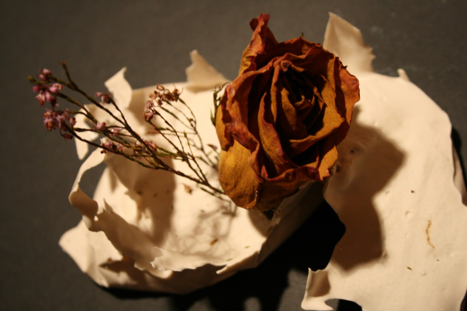
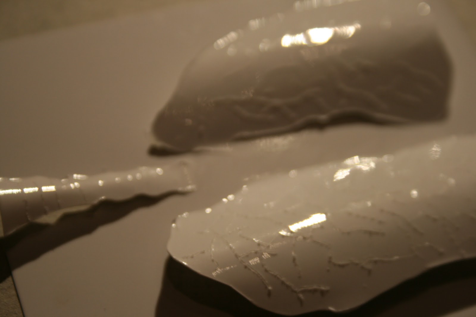
My least successful project was probably 3D because I was ill during this rotation so I did not fully emerge my thoughts into the brief to the best of my ability. I also found 3D challenging because it was very different to anything I had previously done. Throughout this time I have been mainly inspired by the world around me and things I have come across which I can relate in, apart from this I have watched quite a few documentaries on various artists such as art in progress and sky arts which I find very inspiring. Additionally I have been to frieze art fair, the Saatchi gallery and Tate Britain for inspiration. In my approach to my work I generally would ‘brainstorm’ words from the brief and let that begin my journey of the project, yet so far on this foundation I have worked in a wide variety of different ways and learnt that its okay to let the materials not just the concept lead your work to see where it takes you. When approaching my own work in the future I will consider the different things I have learnt here such as less is more and not to over complicate ideas trying to make them complex and intricate when the thinking behind the idea is the most important aspect.


3D Spatial Rotation

Honestly this is the rotation i was looking forawrd to the least because i had this idea that it would be all architecture and interiors. Yet making the 3D maps was alot more interesting than i had anticipated. I expecially enjoyed the timed drawings we did of the maps when finished aswell. I found myself really getting into the 45 minute drawing maybe because i haven't done life drawing in a while, but anyway i am happy with the drawing i created from this. We were then asked to go to a location and make studies from this as inspiration for small structures which we later repeated 5 times. I let the materials lead me for these scultures as i mainly experimented with different tapes, wire, elastic bands and cigarette filters. I really liked the contrast of the filters and elastic band against the rigid wire. We were then given a brief of making 'somewhere for a human to sit thats not a chair'; 'something to walk through thats not a building' and 'something to hold small objects thats not a box.' I did really struggle with inspiration and ideas for this part of the project as someone who has never really worked in 3D before i was a bit thrown by the thought of it. Yet in the end i used aspects of my previous sculputres as inspiration for the new ones, such as the elastic band rouched up on wire was blown up to a bigger scale and used as a chair.

Fine Art Rotation

Like others i was looking foraward to this two weeks as my A level was 'Fine Art' so i got the impression it would be the most familiar and not as alien as fashion and textiles or the other rotations to come. In the beginning we drew from previously made installations in the middle of each room, we experimented with different materials and techniques yet i found drawing in this area much more free rather than specific instructions as to what we had to do like in fashion. I was a bit thrown by this initial task because the installations apparently each had meanings which the objects and videos within them all contributing towards, yet i struggled to see the references. I also discovered the tutors were mostly impressed with the more abstract and simple images made and did not like the use of shading and detail.. i guess to start us off slowly so we could get a real feel for the things we were drawing rather than focusing on making the drawings looking good. We went on to make sculptures out of a cardboard box which i found challenging yet it showed me how you can use your imagination to make the most standard boring object into something completley different which mirrored the drawing studies we had been making.


After this we began self directed mini projects using objects from  home and materials we chose to work with which is where i took more of a grasp on the definition of fine art, working this way and watching others work this way i could see the people who work best in self driven almost biographical situations which i struggled with. Being given so much freedom to express whatever we wanted freaked me out and i sort of lost momentum. I had taken some photos of purple flowers over the weekend which i liked and thought would be good to work from, so i first began a painting of a flower on A2paper.


I wanted to blend the colours really smoothly to try and make the painting realistic, yet David said i needed to get a fat brush and ignore detail which i ended up trying. Working this way did losen me up and allow me to be more experimental rather than just copying the flower exactly from the photograph. I did enjoy this and was pleased with some of the smaller images i produced using watercolours and fine liner.


After this i began to think more about my chosen subject for my work and i was inspired by beauty amongst the concrete jungle we live in, such as flowers creeping out between paving slabs, or a flower bed on the side of a street littered with cans and broken glass. I liked the idea that the natural worldwas rebelling and breaking through the man made. Thinking further about this i felt i needed to experiment with some new materials so i mixed up some plaster and played aroundwith pouring into different shot glasses and plastic boxes and positioning different leaves and flowers in them before they set. I really liked the contrast of the smooth plaster which set against the plastic to the rough areas, yet shot glasses and plastic boxes seemed too formulaic as shapes so i decided to try pouring the plaster into the corners of plastic bags. I was really pleased with the shapes they made as the plaster is such a strong material yet the form of what i had produced was fluid and i felt reflected the shapes and movement of nature.


Visual Communication Rotation

At the foundation show from last year I found vis com the most interesting group of work because it involved many aspects which I am interested in such as photography and advertising so I was eager to begin this rotation to gain a better undertsanding of what it consisted of. I struggled with the initial start of this rotation after being given the words 'leaf' and 'cell' to work with as sort of direction. I filled a small sketchbook with doodles and line drawings of things i associated with the words. We were then asked to use found images from magazines and books combined with our own drawings and thoughts to form a short narrative. I did struggle to get into this because i was unsure of what materials to go with, yet i found using watercolours and fine liner worked really well considering i had not used them very much before. The magazine i had selected had a large feature on tony blair so i chose to focus on images of him as the character in my narrative, also the science encyclopedia i found had some really nice images of water and waves which i liked. Using these images i formed a narrative of tony blair travelling through the jungle in a 4x4 voltswagon when he crashes into a tree so he gets lost in the jungle and finds himself by a river. There is an abandoned boat in the river which he climbs into and travels along trying to find civallisation, but approaching is a waterfall which his boat falls over THE END. :) Here are a few images i selected from my narrative.


I got good feedback from the tutors about the way i presented my narrative because I used the pages of the sketchbook in a variety of experimental ways which i enjoyed. For example using the spine of the book as a river and varying in scale. I was surprised the tutors liked this as i didn't really know what i was doing i just went with the flow and felt to keep the narrative interesting i should vary the way it was presented on each page.

Over the second week our brief was called 'messages' and it was made up about the idea that we had to send a message to someone but not using words. The first example we were given was one girl wanting to tell her dad she wanted to be a stamp collector, which some of us found confusing because the breif said it had to be a serious message, something which was hard to say. So initially i was finding it hard to come up with ideas and inspiration as i thought it had to be light hearted and comical so i explored animal testing on rats who wanted to be punks by having the rats in gothic outfits and spelling out i dont like red in lipstick kisses, i have no idea where this idea came from as its mega random and not really interesting. Then i looked at cats who wanted to be dogs so i drew a cat with a bone in its mouth, woofing and peeing against a tree. I didn't find this subject matter very interesting either, i dont know why i went with animals because i dont even like them.. Whilst struggling with these ideas i spoke to the BA graphics tutor who reassured me that the idea should be personal, serious and true to work best. So i decided to focus on the issue of being prosecuted for buying a chid travel-card and how i could break the news to my mum. I played around with the letter i had recieved, my oystercard and emails to the prosecutors at southern rail. Whilst experimenting with these images i thought about transitioning the oyster card into an inmates identity card. I reproduced the oytercard with watercolours and tried different images in the photobox which i formed into a short animation.


Im happy with the concept i came up with yet the execution is not perfect, and if i hadn't been so confused in the beginning or if we had more time the end product may have turned out  better.

Fashion & Textiles Rotation

This has been an interesting two weeks, i wasn't exactly looking forward to it because i had made pre-conceptions about what it would be like. However i found the free-ness of the two weeks really refreshing. :D They told us not to think of the books we were given as a rigid orderly page by page exercise, but to fold and cut pages aswell as not using it in cronological order. We were given the title of 'Expansion and Compression' on enrolment and were asked to take sequential images with this in mind. This is one of my photos:


We started by creating installations as a group from the objects associated with the title which we had brought in, this was our one:

we then drew from them in various ways, such as continuous line; using the wrong hand; with a partner; using two pens at a time, etc. We then had to make our own installations at home and bring in various objects to continue to work from. I was struggling to understand how the drawing and installations we were making linked to fashion & textiles, untill we began to make basic paper sculptures inspired by our drawings which started to look like folds in fabric and basic structures featured within clothing. We then developed these scultpures further by reproducing them in materials and different weight papers which was interesting because it showed how weights affect the structures and there forms.

I brought in some photos of a friend smoking as some of my chosen objects to work from. Under the title expansion & compression i was struggling to think of what to focus on, so i ended up focusing on my heavy breathing and constant need for nicotine.. lungs expand and compress and the i really like the way the smoke physically shows the air's movement. I was really pleased with the shapes the smoke created :)

Using these photos as inspiration i began to look at the form of lungs and experimented with different paper materials to make different types of basic lungs. The pieces i felt were most successful i re-created on a larger scale and in different colours and materials.


At the end of the two weeks i came to the conclusion (with the help of adrian) that if i had continued this project further i would reproduce the last piece but in black and on a larger scale with someone blowing smoke from the back so it billowed out around the outline of the lungs. A bit like this:

Through these two weeks within this rotation the main things i felt i have learnt are simplicity is key, less is more and not to overwork and complicate things :)